Bez_kres: a website for a meringue pastry studio
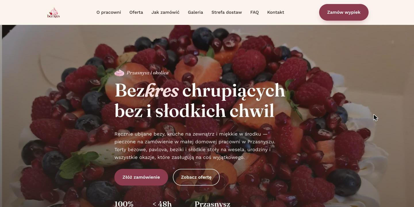
A website for an artisan meringue pastry studio, with the offer, a step-by-step ordering process and a gallery of product photos.
Project goal
Orders and questions about the offer came mainly through private messages and social media, with no single place where a customer could check the range, the lead time and the delivery range on their own. The goal was to build a website that answers these questions by itself, before the customer writes a first message.
Challenge
The artisan meringue dessert studio worked mainly through messages and social media, so customers had no single place to check the offer, the lead time and how to order.
Solution
We designed a website built on strong product photos, a clear step-by-step description of the ordering process and information about the delivery zone, all visible without writing a first message.
Result
Customers check the offer, the lead time and the delivery range on their own before they write to the studio.
What we delivered
Website design
A custom one-page layout built around the offer and the ordering process, not a ready-made template.
UX/UI
A user path leading from product photos, through the offer, to a clear description of the ordering steps.
Responsiveness
A website with a mobile menu and a layout adapted to narrow screens, built mobile-first from the ground up.
Launch
Publication and configuration of the website on the target domain bez-kres.pl.
What the customer sees
A hero with a strong product photo
The first screen builds appetite with a photo of the pastry instead of describing the offer in text alone.
A “How to order” section
The ordering process laid out step by step, visible without writing a message.
A gallery of past work
Photos of earlier pastries that build trust before the first contact.
Delivery zone
A clearly described delivery range, so the customer knows at once whether the order will arrive on time.
Design approach
Instead of a classic contact form in the foreground, the priority was to show the offer, the ordering process and the delivery range, so that the customer has all the information before writing a message. Hence the strong product photos at the top, a separate section leading step by step through the ordering process and a clearly described delivery zone instead of a generic description of the offer.
Technologies
- Static HTML5 and CSS3
- Vanilla JavaScript
- Google Fonts
Need a similar website?
We reply within one business day. The quote is free and binds you to nothing.
Get a free quote